Toss Business Card Redesign
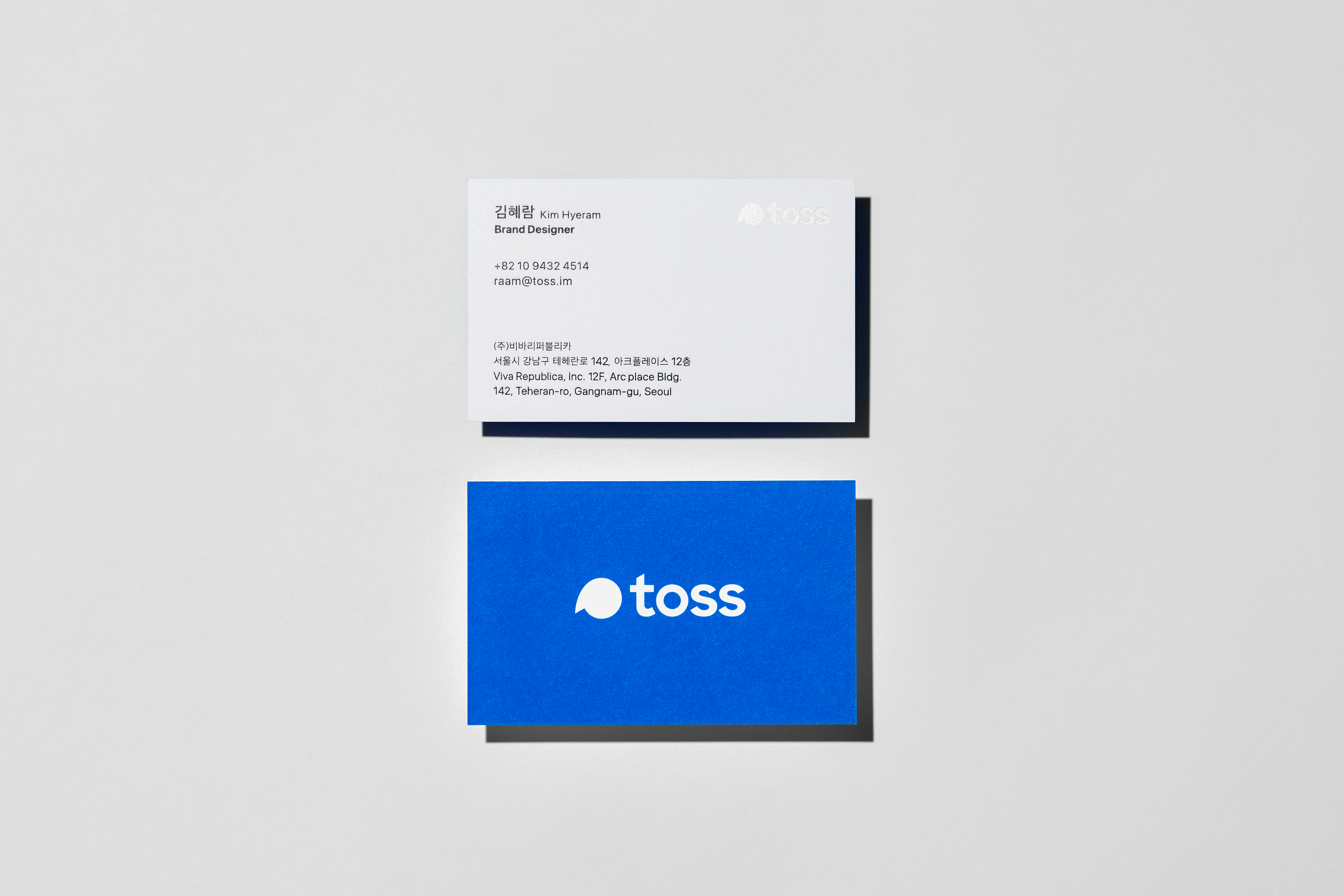
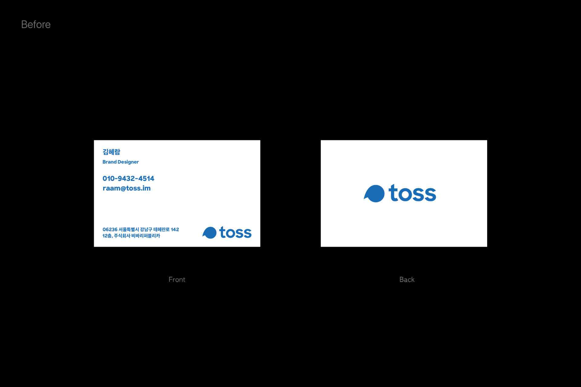
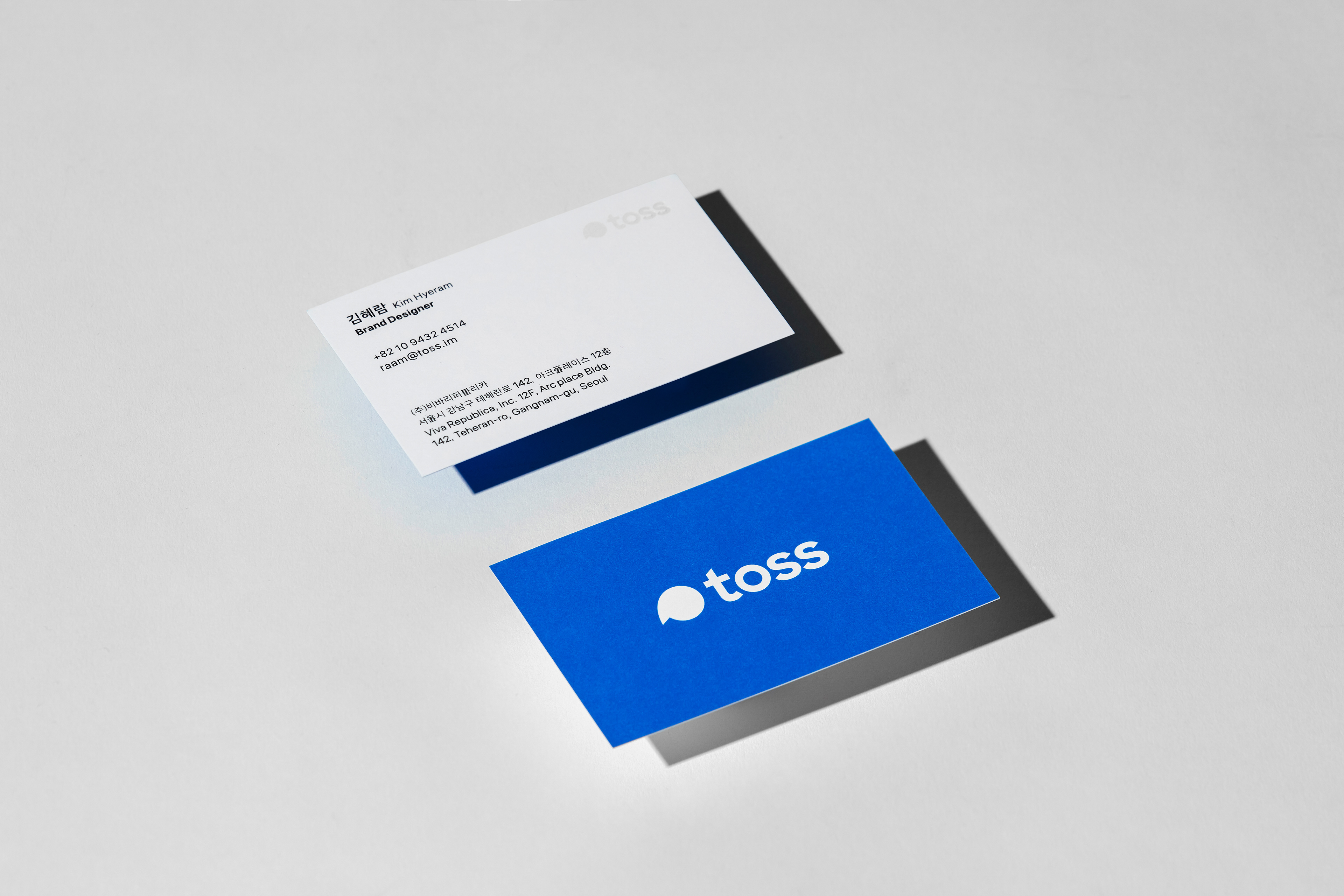
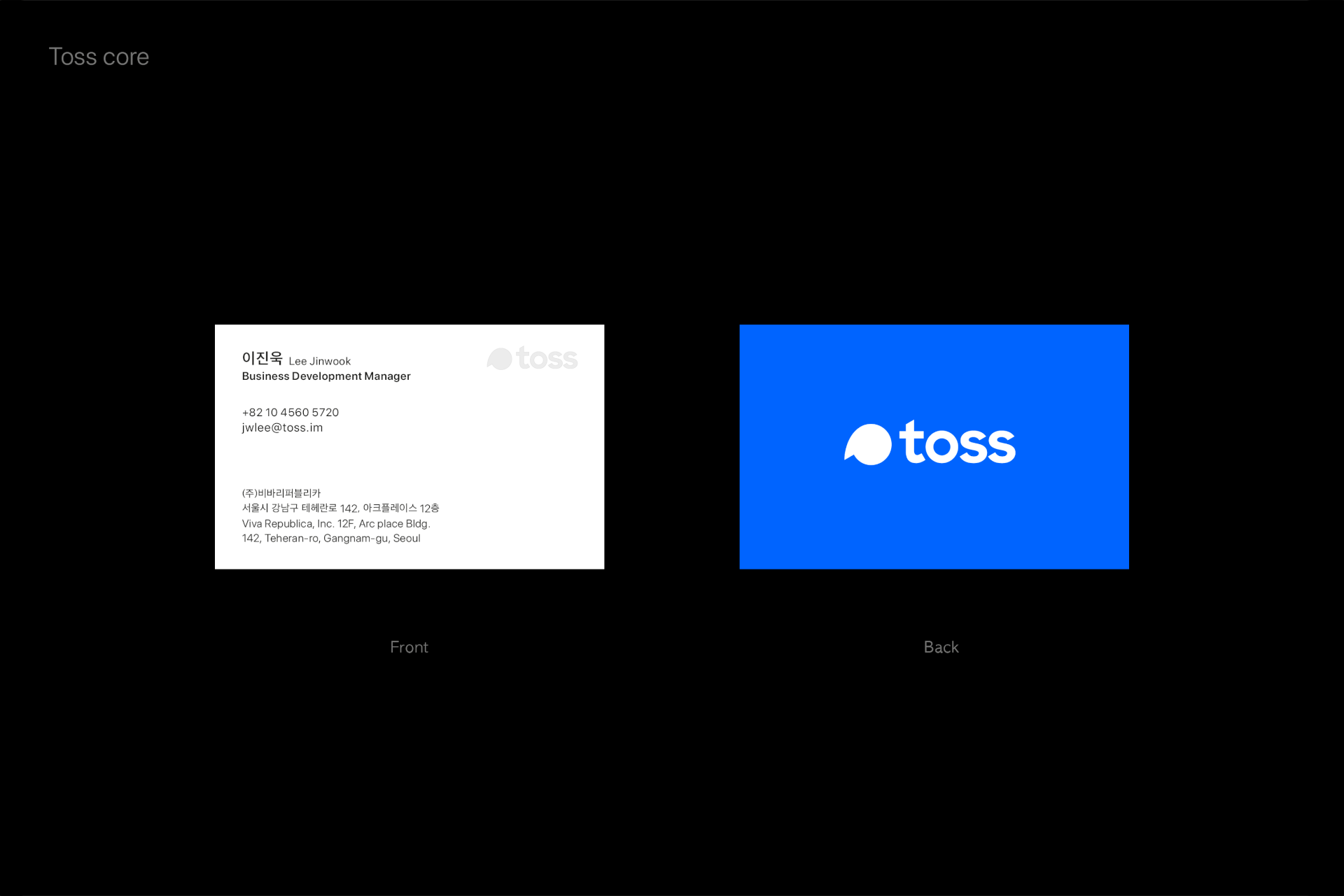
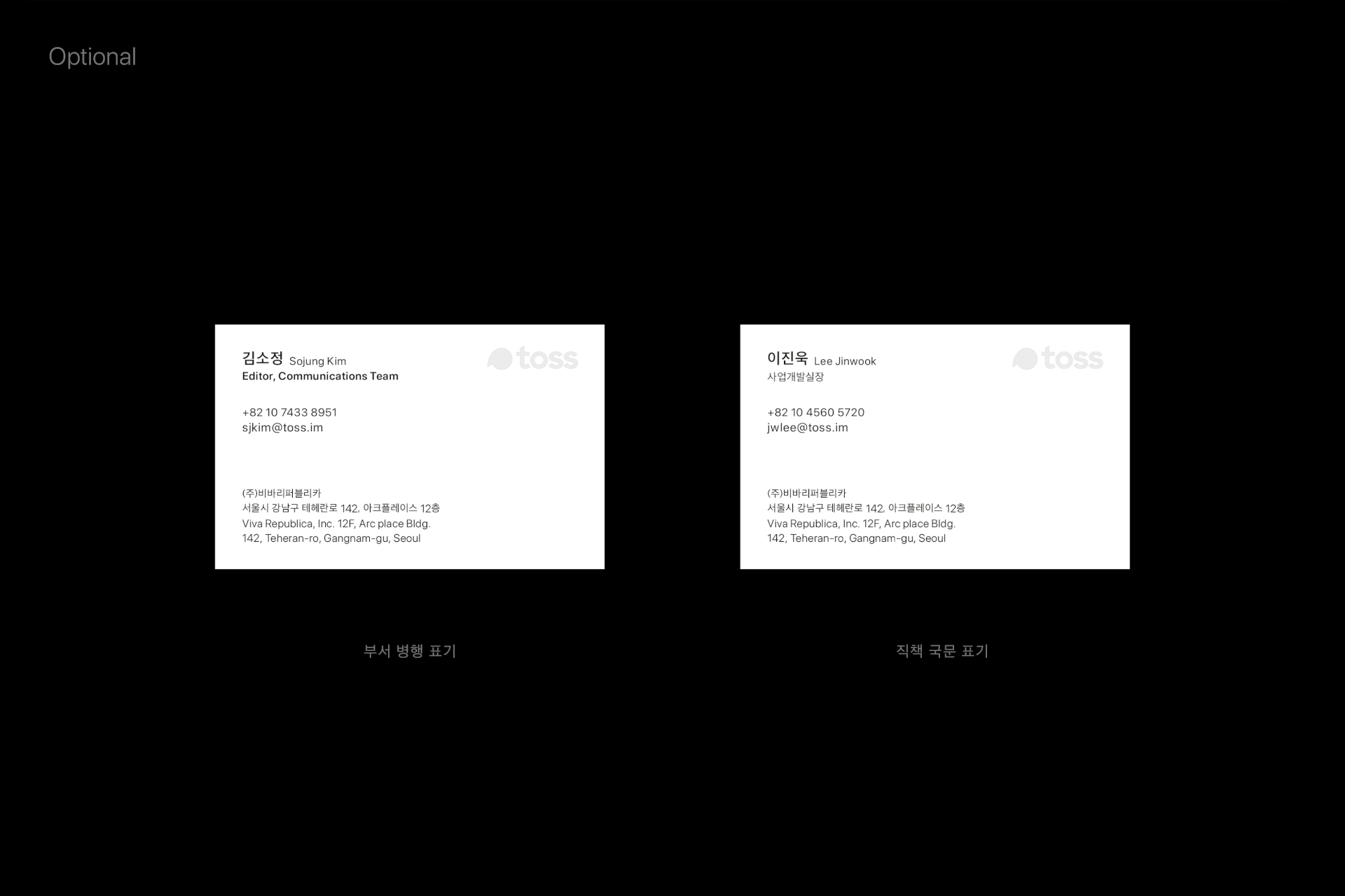
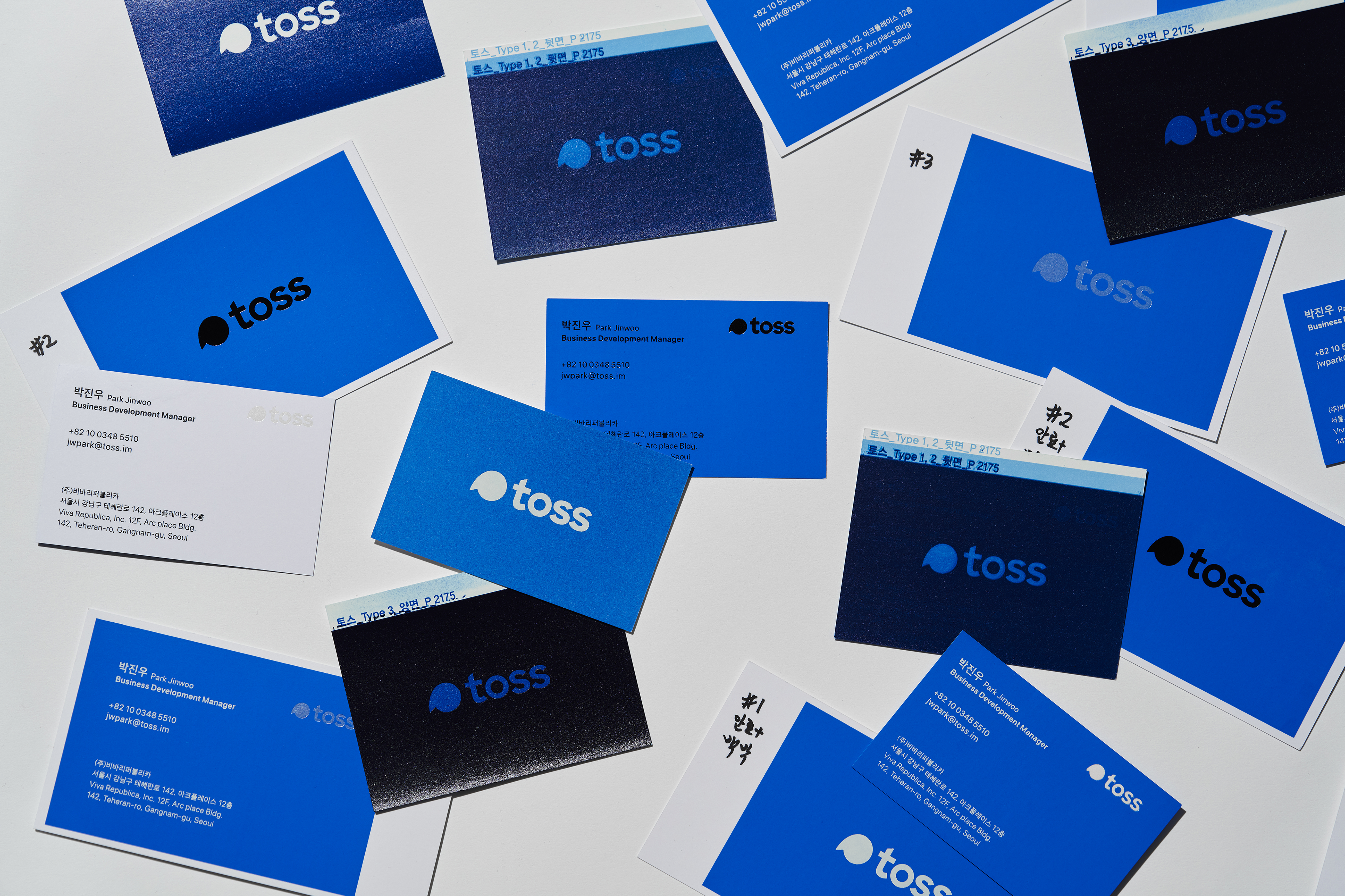
In line with the Toss brand identity refinement, the project involved applying a new brand color and restructuring the logos and hierarchy for all subsidiaries. Accordingly, the business card system across all entities was renewed to reinforce brand consistency. For the front of the card, a readability-focused layout and notation system was developed to systematically accommodate the diverse information of a growing organization. On the back, I focused on delivering the brand identity intuitively by making bold use of 'Toss Blue.'
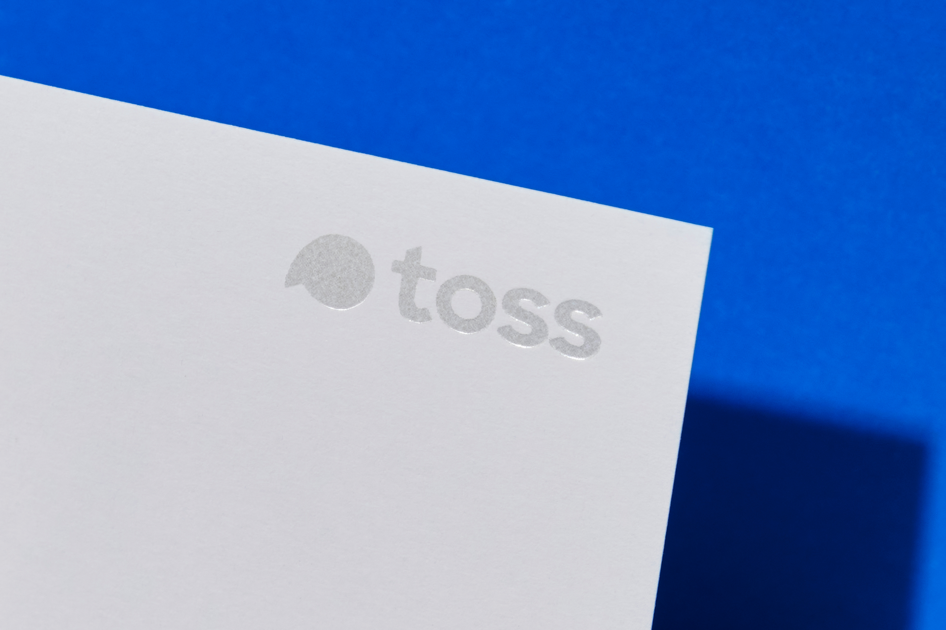
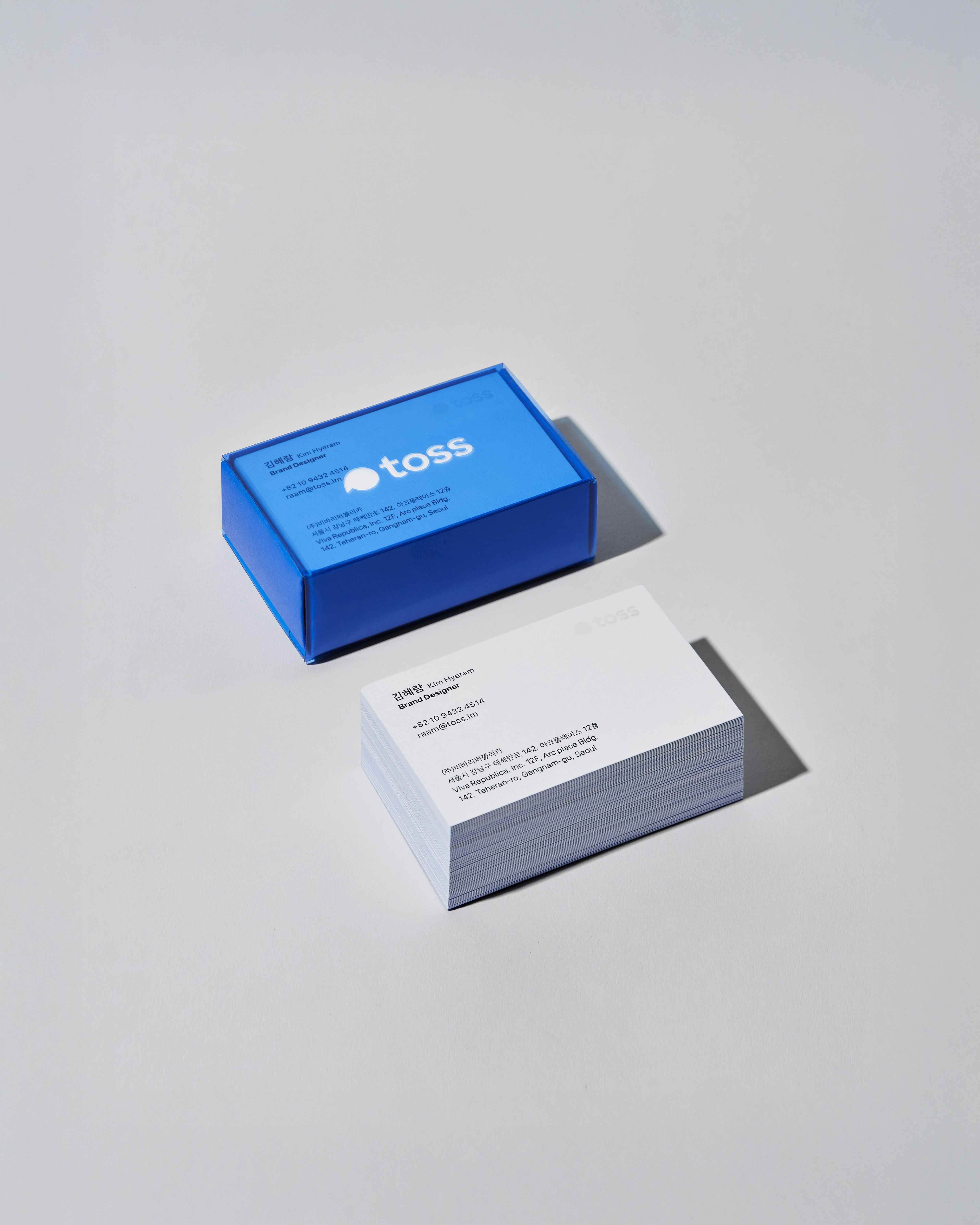
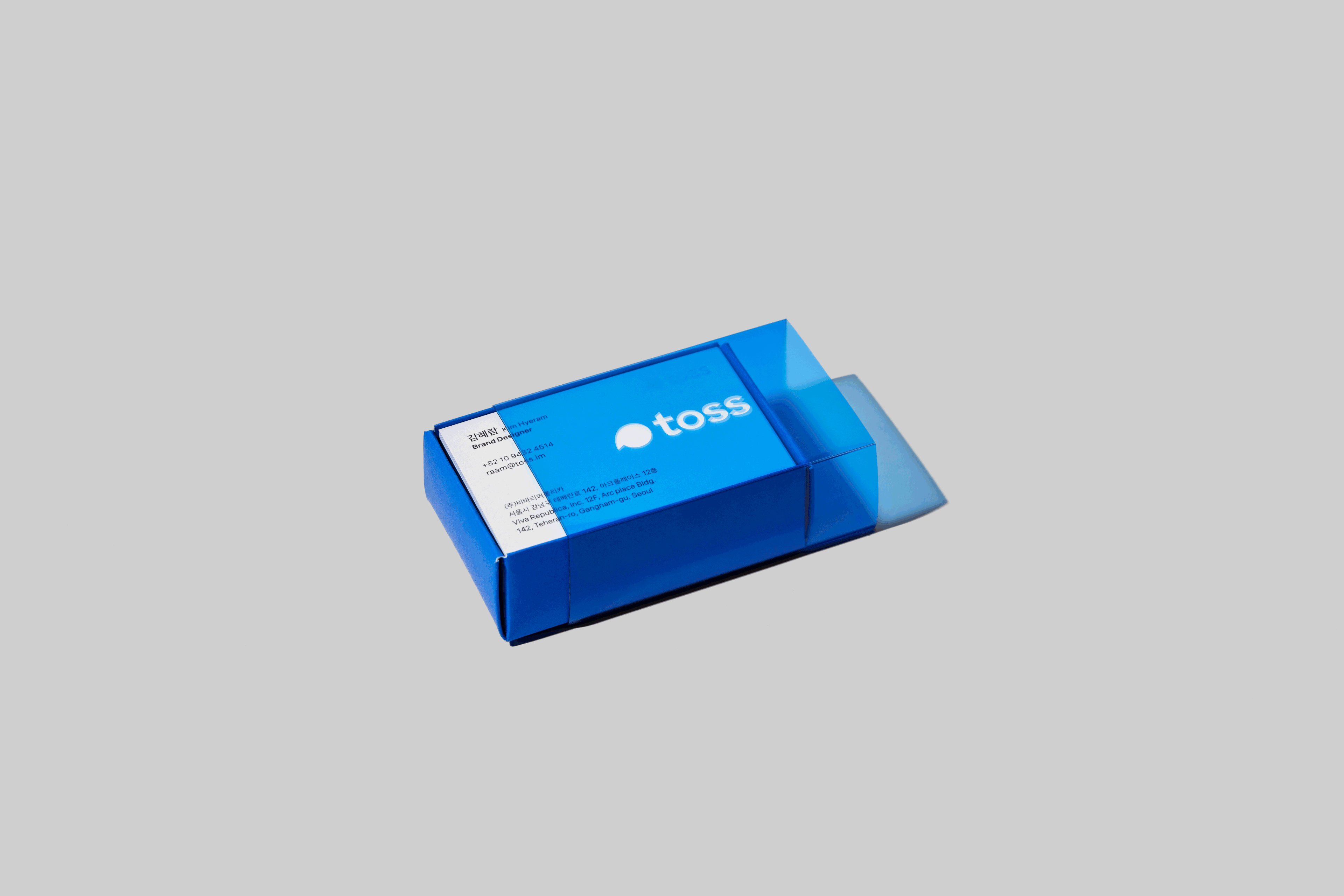
The redesigned business card case was conceived as an extension of the brand experience. The sliding structure reflects the seamless and effortless usability of Toss services, while the translucent material visualizes the core values of trust and transparency. Through extensive material sampling and print testing, optimal tactile quality and color precision were achieved. Finally, by integrating with the internal issuance system, I established a streamlined process that ensures all team members can request business cards under a unified set of brand guidelines.
Toss Business Card Redesign
-
Design
Hyeram Kim, Brand Design Team
-
© 2020 Toss Corp.